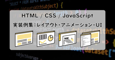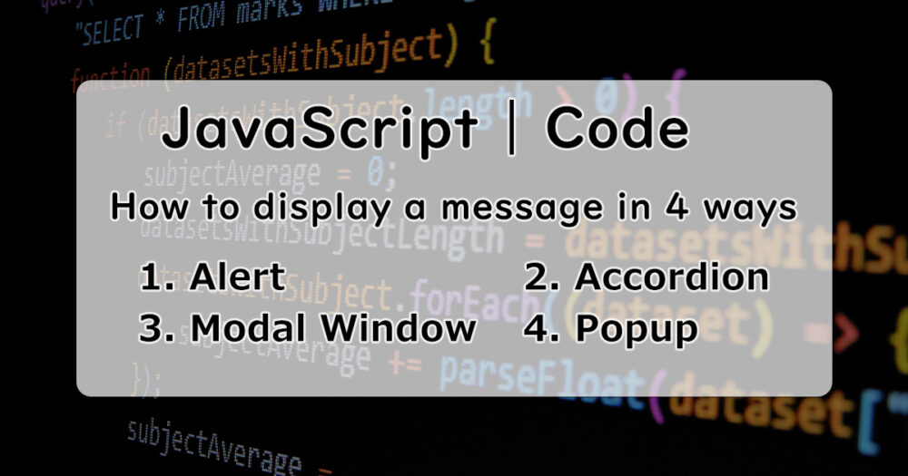
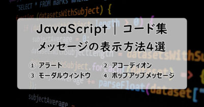
This article shows “how to display a message window if the button clicked” with JavaScript in 4 ways.
Basically this article is for me to learn, but I hope this is for JavaScript beginners.
Examples
Alert
Accordion
Button-2 clicked!
Clicking the button displays a message below the button.
Clicking the button again, the message disappears.
Modal Window
Button-3 clicked!
Clicking the button, the screen gets dark and the message displayed at the middle of the screen.
Clicking the part of dark area, back to normal screen.
Popup Message
Clicking the button displays a message from the bottom of the screen.
In 3 seconds, the message disappears.
HTML / CSS / JavaScript – Code
Button-1: Alert
The simplest way to display a message.
Just use the JavaScript function alert().
<div class="btn-container">
  <button id="btn1">Button-1</button>
</div>
.btn-container {
text-align: center;
}
button {
width: 80%;
height: 50px;
font-size: 18px;
font-weight: bold;
cursor: pointer;
}
button:hover {
opacity: 0.7;
}const btn1 = document.getElementById('btn1');
btn1.addEventListener('click', () => {
alert('Button-1 clicked');
});Button-2: Accordion
Set the message below the button and it can be appeared and disappeared clicking the button.
You can also make an accordion menu with this way.
<div class="btn-container">
<button id="btn2">Button-2</button>
<p id="btn2-text" class="hidden">Button-2 clicked!</p>
</div>- Add the “hidden” class to the message node.
.btn-container {
  text-align: center;
}

button {
  width: 80%;
  height: 50px;
  font-size: 18px;
  font-weight: bold;
  cursor: pointer;
}

button:hover {
 opacity: 0.7;
}
.hidden {
display: none;
}
#btn2-text{
margin: 16px 0;
font-size: 14px;
color: red;
}- The nodes with the “hidden” classes are undisplayed due to the CSS: “.hidden {display: none;}”.
- The nodes can be displayed if the “hidden” class is removed with JavaScript.
const btn2 = document.getElementById('btn2');
const btn2Text = document.getElementById('btn2-text');

btn2.addEventListener('click', () => {
  btn2Text.classList.toggle('hidden');
});- If the button clicked, the “hidden” class of the message node is removed or added.
Button-3: Modal Window
Set the dark screen layer(mask) and the message window and these can be appeared and disappeared clicking the button.
This way is called “modal window” generally.
<div class="btn-container">
  <button id="btn3">Button-3</button>
</div>
<div id="mask" class="hidden"></div>
<section id="modal" class="hidden">
  <p>Button-3 clicked!</p>
</section>- Add the “hidden” class to the mask and the message window node.
.btn-container {
  text-align: center;
}

button {
  width: 80%;
  height: 50px;
  font-size: 18px;
  font-weight: bold;
  cursor: pointer;
}

button:hover {
 opacity: 0.7;
}

.hidden {
  display: none;
}

#mask {
  background: rgba(0, 0, 0, 0.7);
  position: fixed;
  top: 0;
  bottom: 0;
  right: 0;
  left: 0;
  z-index: 1;
}

#modal {
  background: #fff;
  width: 50%;
  padding: 24px;
  border-radius: 4px;
  color: red;
  position: fixed;
  top: 50%;
  left: 10%;
  right: 10%;
  text-align: center;
  margin: 0 auto;
  z-index: 2;
}- The nodes with “hidden” classes are undisplayed due to the CSS: “.hidden {display: none;}”.
- The nodes can be displayed if the “hidden” classes are removed with JavaScript.
- Adjust the positions of the mask and the message window with these properties: position, top, bottom, left, right and z-index.
const btn3 = document.getElementById('btn3');
const mask = document.getElementById('mask');
const modal = document.getElementById('modal');

btn3.addEventListener('click', () => {
  mask.classList.remove('hidden');
  modal.classList.remove('hidden');
});

mask.addEventListener('click', () => {
  mask.classList.add('hidden');
  modal.classList.add('hidden');
});- If the button clicked, the “hidden” classes of the mask and the message window node are removed.
- If the mask(dark part) clicked, the “hidden” classes are added to the mask and the message window node, then these are undisplayed.
Button-4: Popup Message
Set the message at the bottom of the screen and it can be appeared and disappeared with css animation clicking the button.
<div class="btn-container">
  <button id="btn4">Button-4</button>
</div>
<p id="btn4-text" class="hidden">Button-4 Clicked!</p>
.btn-container {
text-align: center;
}
button {
width: 80%;
height: 50px;
font-size: 18px;
font-weight: bold;
cursor: pointer;
}
button:hover {
opacity: 0.7;
}
.hidden {
display: none;
}
#btn4-text {
height: 72px;
padding: 8px 16px;
border-radius: 8px;
background: #ddd;
font-weight: bold;
text-align: center;
line-height: 72px;
position: fixed;
right: 5%;
bottom: 10%;
}
.popup-message {
animation: popup 3s forwards;
}
@keyframes popup {
0% {
transform: translateY(15%);
opacity: 0;
}
10%, 90% {
transform: none;
opacity: 1;
}
100% {
transform: translateY(15%);
opacity: 0;
pointer-events: none;
}
}const btn4Text = document.getElementById('btn4-text');
const btn4 = document.getElementById('btn4');
btn4.addEventListener('click', () => {
btn4Text.classList.remove('hidden');
btn4Text.classList.add('popup-message');
});
btn4Text.addEventListener('animationend', () => {
btn4Text.classList.remove('popup-message');
btn4Text.classList.add('hidden');
});My Coding examples
You can find more coding examples this article(Japanese).