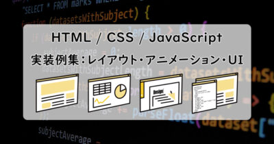
ハンバーガーメニュー デザイン見本
三本線アイコンをクリックして「X」に変形させ、メニューをフェードイン表示するハンバーガーメニューの実装デモ。コピーしてすぐに使えるHTML・CSS・JSのコードを掲載しています。
HTML・CSS・JSコードプレビューツール にて実装確認ができます。
① アイコン — 三本線をクリックで「X」に変形させる
状態: 三本線
<div class="hamburger-menu">
  <div class="line"></div>
  <div class="line"></div>
  <div class="line"></div>
</div>.hamburger-menu {
width: 30px;
height: 22px;
position: relative;
cursor: pointer;
outline: none !important;
-webkit-tap-highlight-color: rgba(0,0,0,0);
user-select: none;
-webkit-user-select: none;
}
.line {
background-color: #333;
height: 4px;
width: 100%;
position: absolute;
border-radius: 2px;
transition: all 0.3s;
}
.line:nth-of-type(1) { top: 0; }
.line:nth-of-type(2) { top: 50%; transform: translateY(-50%); }
.line:nth-of-type(3) { bottom: 0; }
.hamburger-menu.active .line:nth-of-type(1) {
top: 50%;
transform: translateY(-50%) rotate(45deg);
}
.hamburger-menu.active .line:nth-of-type(2) {
display: none;
}
.hamburger-menu.active .line:nth-of-type(3) {
top: 50%;
transform: translateY(-50%) rotate(-45deg);
}const menu = document.querySelector('.hamburger-menu');
menu.addEventListener('click', function() {
menu.classList.toggle('active');
});三本線は、position: relative の親要素内に position: absolute で3本の横線を上・中・下に配置して作ります。クリック時に active クラスを付与し、1本目を rotate(45deg)、3本目を rotate(-45deg) で回転させ、2本目は display: none で隠すことで「X」形状になります。transition: all 0.3s を指定することで、変形がアニメーションとして滑らかに見えます。
② メニュー表示 — クリックでフェードイン表示させる
メニュー: 非表示
<div class="hamburger-menu">
  <div class="line"></div>
  <div class="line"></div>
  <div class="line"></div>
</div>
<nav class="nav-menu">
  <a href="#">メニュー 1</a>
  <a href="#">メニュー 2</a>
  <a href="#">メニュー 3</a>
</nav>.hamburger-menu {
width: 30px;
height: 22px;
position: absolute;
top: 20px;
right: 20px;
cursor: pointer;
outline: none !important;
-webkit-tap-highlight-color: rgba(0,0,0,0);
user-select: none;
-webkit-user-select: none;
}
.line {
background-color: #333;
height: 4px;
width: 100%;
position: absolute;
border-radius: 2px;
transition: all 0.3s;
}
.line:nth-of-type(1) { top: 0; }
.line:nth-of-type(2) { top: 50%; transform: translateY(-50%); }
.line:nth-of-type(3) { bottom: 0; }
.hamburger-menu.active .line:nth-of-type(1) {
top: 50%;
transform: translateY(-50%) rotate(45deg);
}
.hamburger-menu.active .line:nth-of-type(2) { display: none; }
.hamburger-menu.active .line:nth-of-type(3) {
top: 50%;
transform: translateY(-50%) rotate(-45deg);
}
.nav-menu {
display: none;
flex-direction: column;
align-items: center;
position: fixed;
top: 45%;
left: 50%;
transform: translate(-50%, -50%);
padding: 8px 16px;
background: #fff;
border: 1px solid #ddd;
border-radius: 10px;
box-shadow: 0 4px 16px rgba(0,0,0,0.12);
opacity: 0;
}
.nav-menu.active {
display: flex;
animation: fadeIn 0.5s forwards;
}
.nav-menu a {
text-decoration: none;
color: #333;
padding: 6px 10px;
font-weight: 600;
}
@keyframes fadeIn {
0% { top: 45%; opacity: 0; }
100% { top: 50%; opacity: 1; }
}const menu = document.querySelector('.hamburger-menu');
const nav = document.querySelector('.nav-menu');
menu.addEventListener('click', function() {
menu.classList.toggle('active');
nav.classList.toggle('active');
});メニューは初期状態を display: none に設定し、クリック時に active クラスを付与して display: flex に切り替えます。同時に @keyframes で定義した fadeIn アニメーション(top: 45% → 50% + opacity: 0 → 1)を適用することで、ふわっと下から現れる表示効果を実現します。animation に forwards を指定すると、アニメーション終了後の状態(opacity: 1)が維持されます。
③ レスポンシブ対応 — PCとスマホで表示を切り替える
表示モード: PC幅(800px超)
<div class="container">
  <div class="header">
    <div class="logo">LOGO</div>
    <nav class="pc-menu">
      <a href="#">メニュー 1</a>
      <a href="#">メニュー 2</a>
      <a href="#">メニュー 3</a>
    </nav>
    <div class="hamburger-menu">
      <div class="line"></div>
      <div class="line"></div>
      <div class="line"></div>
    </div>
  </div>
  <nav class="nav-menu">
    <a href="#">メニュー 1</a>
    <a href="#">メニュー 2</a>
    <a href="#">メニュー 3</a>
  </nav>
</div>.container {
position: relative;
}
.header {
width: 100%;
height: 60px;
background: #1e293b;
display: flex;
align-items: center;
justify-content: space-between;
padding: 0 20px;
box-sizing: border-box;
}
.logo {
color: #fff;
font-weight: 700;
}
.pc-menu {
display: flex;
gap: 20px;
}
.pc-menu a {
color: #fff;
text-decoration: none;
font-size: 0.9rem;
}
.hamburger-menu {
display: none;
width: 26px;
height: 20px;
position: relative;
cursor: pointer;
outline: none !important;
-webkit-tap-highlight-color: rgba(0,0,0,0);
user-select: none;
-webkit-user-select: none;
}
.line {
background-color: #fff;
height: 3px;
width: 100%;
position: absolute;
border-radius: 2px;
transition: all 0.3s;
}
.line:nth-of-type(1) { top: 0; }
.line:nth-of-type(2) { top: 50%; transform: translateY(-50%); }
.line:nth-of-type(3) { bottom: 0; }
.hamburger-menu.active .line:nth-of-type(1) {
top: 50%; transform: translateY(-50%) rotate(45deg);
}
.hamburger-menu.active .line:nth-of-type(2) { display: none; }
.hamburger-menu.active .line:nth-of-type(3) {
top: 50%; transform: translateY(-50%) rotate(-45deg);
}
.nav-menu {
display: none;
flex-direction: column;
align-items: center;
position: fixed;
top: 45%;
left: 50%;
transform: translate(-50%, -50%);
padding: 8px 16px;
background: #fff;
border: 1px solid #ddd;
border-radius: 10px;
box-shadow: 0 4px 16px rgba(0,0,0,0.12);
opacity: 0;
z-index: 10;
}
.nav-menu.active {
display: flex;
animation: fadeIn 0.5s forwards;
}
.nav-menu a {
text-decoration: none;
color: #333;
padding: 6px 10px;
font-weight: 600;
}
@keyframes fadeIn {
0% { top: 45%; opacity: 0; }
100% { top: 50%; opacity: 1; }
}
@media (max-width: 800px) {
.hamburger-menu { display: block; }
.pc-menu { display: none; }
}const menu = document.querySelector('.hamburger-menu');
const nav = document.querySelector('.nav-menu');
menu.addEventListener('click', function() {
menu.classList.toggle('active');
nav.classList.toggle('active');
});@media (max-width: 800px) を使い、画面幅が 800px 以下のとき .hamburger-menu を display: block で表示させ、.pc-menu を display: none で隠します。800px を超える PC 幅では逆に .hamburger-menu が display: none のままで、.pc-menu が表示されます。スマホでハンバーガーアイコンをクリックしてメニューを表示する動作は、ステップ②の実装をそのまま流用します。
当サイトで公開しているWebデザインやUIの実装例は、一覧として以下記事に纏めています。