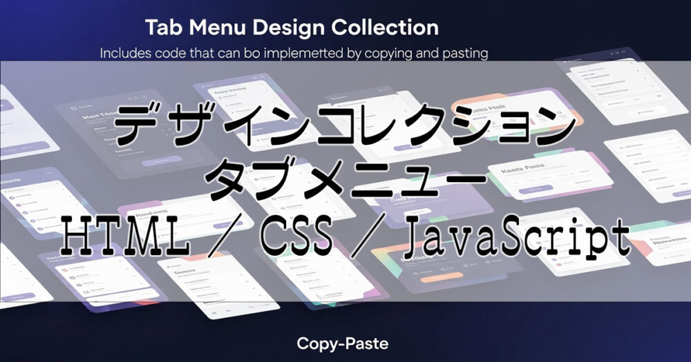
実装例&コード付き!異なるデザインパターンのタブメニューを集めました!
JavaScriptは共通なので、以下よりご利用ください。
JavaScript コードはこちら(全デザイン共通)
// 全てのタブコンテナを取得
const tabContainers = document.querySelectorAll('.tab-container');
// 各タブコンテナに対してイベントリスナーを設定
tabContainers.forEach(container => {
const tabMenuItems = container.querySelectorAll('ul li');
const tabContents = container.querySelectorAll('.tab-content');
tabMenuItems.forEach(tabMenuItem => {
tabMenuItem.addEventListener('click', () => {
// 現在のコンテナ内の全てのタブからselectedクラスを外す
tabMenuItems.forEach(item => {
item.classList.remove('selected');
});
// クリックされたタブのみselectedクラスを付ける
tabMenuItem.classList.add('selected');
// 現在のコンテナ内の全てのタブのコンテンツからselectedクラスを外す
tabContents.forEach(tabContent => {
tabContent.classList.remove('selected');
});
// クリックされたタブのカスタムデータ属性と同じIDを持つコンテンツに、selectedクラスを付ける
document.getElementById(tabMenuItem.dataset.id).classList.add('selected');
});
});
});
タブメニューとは?
タブメニューは、複数のコンテンツを切り替えて表示できるUIです。見出し(タブ)をクリックすると、対応する内容だけが表示されるため、情報を整理して見せるのに適しています。
タブメニューの実装方法を詳しく知りたい方はこちら


【JS&CSS】クリックやホバーで表示を切り替える(タブメニュー)
タイトルなどの見出し(タブ)をクリック または マウスホバーすると、それに応じた内容を表示させる『タブメニュー』の実装方法(HTML/CSS/JavaScriptコード)を、実装…
【1】シンプル
- タブ1
- タブ2
- タブ3
おはようございます。タブ1の内容です。
こんにちは。タブ2の内容です。
こんばんは。タブ3の内容です。
HTML / CSS コードはこちら
<section class="design-section">
<div class="tab-container tab-design-1">
<ul>
<li class="selected" data-id="tab-1-1">タブ1</li>
<li data-id="tab-1-2">タブ2</li>
<li data-id="tab-1-3">タブ3</li>
</ul>
<div class="tab-content selected" id="tab-1-1">
おはようございます。タブ1の内容です。
</div>
<div class="tab-content" id="tab-1-2">
こんにちは。タブ2の内容です。
</div>
<div class="tab-content" id="tab-1-3">
こんばんは。タブ3の内容です。
</div>
</div>
</section>
.tab-design-1 ul {
margin: 0;
padding: 0;
list-style: none;
display: flex;
border-bottom: 2px solid #ddd;
}
.tab-design-1 ul li {
width: 100%;
padding: 12px 20px;
text-align: center;
cursor: pointer;
transition: all 0.3s ease;
border-bottom: 3px solid transparent;
}
.tab-design-1 ul li.selected {
color: #1976d2;
background-color: #f5f5f5;
border-bottom-color: #1976d2;
}
.tab-design-1 ul li:not(.selected):hover {
background-color: #f0f0f0;
}
.tab-design-1 .tab-content {
display: none;
padding: 20px;
min-height: 150px;
}
.tab-design-1 .tab-content.selected {
display: block;
}
【2】モダン
- タブ1
- タブ2
- タブ3
おはようございます。タブ1の内容です。
こんにちは。タブ2の内容です。
こんばんは。タブ3の内容です。
HTML / CSS コードはこちら
<section class="design-section">
<div class="tab-container tab-design-2">
<ul>
<li class="selected" data-id="tab-2-1">タブ1</li>
<li data-id="tab-2-2">タブ2</li>
<li data-id="tab-2-3">タブ3</li>
</ul>
<div class="tab-content selected" id="tab-2-1">
おはようございます。タブ1の内容です。
</div>
<div class="tab-content" id="tab-2-2">
こんにちは。タブ2の内容です。
</div>
<div class="tab-content" id="tab-2-3">
こんばんは。タブ3の内容です。
</div>
</div>
</section>
.tab-design-2 ul {
margin: 0;
padding: 0;
list-style: none;
display: flex;
background: #f8f9fa;
border-radius: 8px 8px 0 0;
overflow: hidden;
}
.tab-design-2 ul li {
flex: 1;
padding: 16px 24px;
text-align: center;
cursor: pointer;
transition: all 0.3s ease;
position: relative;
color: #666;
}
.tab-design-2 ul li.selected {
color: #fff;
background: linear-gradient(135deg, #667eea 0%, #764ba2 100%);
box-shadow: 0 4px 12px rgba(102, 126, 234, 0.4);
}
.tab-design-2 ul li:not(.selected):hover {
background: rgba(102, 126, 234, 0.1);
color: #667eea;
}
.tab-design-2 .tab-content {
display: none;
padding: 24px;
min-height: 150px;
background: white;
border-radius: 0 0 8px 8px;
box-shadow: 0 4px 12px rgba(0,0,0,0.1);
}
.tab-design-2 .tab-content.selected {
display: block;
}
【3】カード風
- タブ1
- タブ2
- タブ3
おはようございます。タブ1の内容です。
こんにちは。タブ2の内容です。
こんばんは。タブ3の内容です。
HTML / CSS コードはこちら
<section class="design-section">
<div class="tab-container tab-design-3">
<ul>
<li class="selected" data-id="tab-3-1">タブ1</li>
<li data-id="tab-3-2">タブ2</li>
<li data-id="tab-3-3">タブ3</li>
</ul>
<div class="tab-content selected" id="tab-3-1">
おはようございます。タブ1の内容です。
</div>
<div class="tab-content" id="tab-3-2">
こんにちは。タブ2の内容です。
</div>
<div class="tab-content" id="tab-3-3">
こんばんは。タブ3の内容です。
</div>
</div>
</section>
.tab-design-3 ul {
margin: 0;
padding: 0;
list-style: none;
display: flex;
gap: 8px;
margin-bottom: 20px;
}
.tab-design-3 ul li {
flex: 1;
padding: 12px 20px;
text-align: center;
cursor: pointer;
transition: all 0.3s ease;
background: white;
border: 2px solid #e0e0e0;
border-radius: 8px;
color: #666;
box-shadow: 0 2px 4px rgba(0,0,0,0.1);
}
.tab-design-3 ul li.selected {
color: #fff;
background: #ff6b6b;
border-color: #ff6b6b;
box-shadow: 0 4px 12px rgba(255, 107, 107, 0.4);
transform: translateY(-2px);
}
.tab-design-3 ul li:not(.selected):hover {
border-color: #ff6b6b;
color: #ff6b6b;
transform: translateY(-1px);
}
.tab-design-3 .tab-content {
display: none;
padding: 24px;
min-height: 150px;
background: white;
border-radius: 8px;
box-shadow: 0 4px 12px rgba(0,0,0,0.1);
}
.tab-design-3 .tab-content.selected {
display: block;
}
【4】グラデーション
- タブ1
- タブ2
- タブ3
おはようございます。タブ1の内容です。
こんにちは。タブ2の内容です。
こんばんは。タブ3の内容です。
HTML / CSS コードはこちら
<section class="design-section">
<div class="tab-container tab-design-4">
<ul>
<li class="selected" data-id="tab-4-1">タブ1</li>
<li data-id="tab-4-2">タブ2</li>
<li data-id="tab-4-3">タブ3</li>
</ul>
<div class="tab-content selected" id="tab-4-1">
おはようございます。タブ1の内容です。
</div>
<div class="tab-content" id="tab-4-2">
こんにちは。タブ2の内容です。
</div>
<div class="tab-content" id="tab-4-3">
こんばんは。タブ3の内容です。
</div>
</div>
</section>
.tab-design-4 ul {
margin: 0;
padding: 0;
list-style: none;
display: flex;
background: linear-gradient(45deg, #667eea, #764ba2);
border-radius: 12px 12px 0 0;
overflow: hidden;
position: relative;
}
.tab-design-4 ul::before {
content: '';
position: absolute;
top: 0;
left: 0;
right: 0;
bottom: 0;
background: linear-gradient(45deg, transparent, rgba(255,255,255,0.1), transparent);
animation: shimmer 2s infinite;
}
@keyframes shimmer {
0% { transform: translateX(-100%); }
100% { transform: translateX(100%); }
}
.tab-design-4 ul li {
flex: 1;
padding: 16px 24px;
text-align: center;
cursor: pointer;
transition: all 0.3s ease;
position: relative;
color: rgba(255,255,255,0.8);
border-right: 1px solid rgba(255,255,255,0.2);
}
.tab-design-4 ul li:last-child {
border-right: none;
}
.tab-design-4 ul li.selected {
color: #fff;
background: rgba(255,255,255,0.2);
backdrop-filter: blur(10px);
font-weight: bold;
}
.tab-design-4 ul li:not(.selected):hover {
background: rgba(255,255,255,0.1);
color: #fff;
}
.tab-design-4 .tab-content {
display: none;
padding: 24px;
min-height: 150px;
background: linear-gradient(135deg, #f5f7fa 0%, #c3cfe2 100%);
border-radius: 0 0 12px 12px;
box-shadow: 0 4px 12px rgba(0,0,0,0.1);
}
.tab-design-4 .tab-content.selected {
display: block;
}
【5】ミニマル
- タブ1
- タブ2
- タブ3
おはようございます。タブ1の内容です。
こんにちは。タブ2の内容です。
こんばんは。タブ3の内容です。
HTML / CSS コードはこちら
<section class="design-section">
<div class="tab-container tab-design-5">
<ul>
<li class="selected" data-id="tab-5-1">タブ1</li>
<li data-id="tab-5-2">タブ2</li>
<li data-id="tab-5-3">タブ3</li>
</ul>
<div class="tab-content selected" id="tab-5-1">
おはようございます。タブ1の内容です。
</div>
<div class="tab-content" id="tab-5-2">
こんにちは。タブ2の内容です。
</div>
<div class="tab-content" id="tab-5-3">
こんばんは。タブ3の内容です。
</div>
</div>
</section>
.tab-design-5 ul {
margin: 0;
padding: 0;
list-style: none;
display: flex;
border-bottom: 1px solid #e0e0e0;
}
.tab-design-5 ul li {
flex: 1;
padding: 16px 24px;
text-align: center;
cursor: pointer;
transition: all 0.3s ease;
position: relative;
color: #999;
font-weight: 300;
letter-spacing: 0.5px;
}
.tab-design-5 ul li.selected {
color: #333;
font-weight: 500;
}
.tab-design-5 ul li.selected::after {
content: '';
position: absolute;
bottom: -1px;
left: 0;
right: 0;
height: 2px;
background: #333;
animation: slideIn 0.3s ease;
}
@keyframes slideIn {
from { transform: scaleX(0); }
to { transform: scaleX(1); }
}
.tab-design-5 ul li:not(.selected):hover {
color: #666;
background: #fafafa;
}
.tab-design-5 .tab-content {
display: none;
padding: 32px 24px;
min-height: 150px;
color: #666;
line-height: 1.6;
}
.tab-design-5 .tab-content.selected {
display: block;
animation: fadeIn 0.3s ease;
}
@keyframes fadeIn {
from { opacity: 0; transform: translateY(10px); }
to { opacity: 1; transform: translateY(0); }
}
【6】ダーク
- タブ1
- タブ2
- タブ3
おはようございます。タブ1の内容です。
こんにちは。タブ2の内容です。
こんばんは。タブ3の内容です。
HTML / CSS コードはこちら
<section class="design-section">
<div class="tab-container tab-design-6">
<ul>
<li class="selected" data-id="tab-6-1">タブ1</li>
<li data-id="tab-6-2">タブ2</li>
<li data-id="tab-6-3">タブ3</li>
</ul>
<div class="tab-content selected" id="tab-6-1">
おはようございます。タブ1の内容です。
</div>
<div class="tab-content" id="tab-6-2">
こんにちは。タブ2の内容です。
</div>
<div class="tab-content" id="tab-6-3">
こんばんは。タブ3の内容です。
</div>
</div>
</section>
.tab-design-6 ul {
margin: 0;
padding: 0;
list-style: none;
display: flex;
background: #1a1a1a;
border-radius: 8px 8px 0 0;
overflow: hidden;
}
.tab-design-6 ul li {
flex: 1;
padding: 16px 24px;
text-align: center;
cursor: pointer;
transition: all 0.3s ease;
color: #888;
border-right: 1px solid #333;
}
.tab-design-6 ul li:last-child {
border-right: none;
}
.tab-design-6 ul li.selected {
color: #fff;
background: #333;
box-shadow: inset 0 2px 4px rgba(0,0,0,0.3);
}
.tab-design-6 ul li:not(.selected):hover {
background: #2a2a2a;
color: #ccc;
}
.tab-design-6 .tab-content {
display: none;
padding: 24px;
min-height: 150px;
background: #2a2a2a;
color: #fff;
border-radius: 0 0 8px 8px;
box-shadow: 0 4px 12px rgba(0,0,0,0.3);
}
.tab-design-6 .tab-content.selected {
display: block;
}
【7】吹き出し風
- タブ1
- タブ2
- タブ3
おはようございます。タブ1の内容です。
こんにちは。タブ2の内容です。
こんばんは。タブ3の内容です。
HTML / CSS コードはこちら
<section class="design-section">
<div class="tab-container tab-design-7">
<ul>
<li class="selected" data-id="tab-7-1">タブ1</li>
<li data-id="tab-7-2">タブ2</li>
<li data-id="tab-7-3">タブ3</li>
</ul>
<div class="tab-content selected" id="tab-7-1">
おはようございます。タブ1の内容です。
</div>
<div class="tab-content" id="tab-7-2">
こんにちは。タブ2の内容です。
</div>
<div class="tab-content" id="tab-7-3">
こんばんは。タブ3の内容です。
</div>
</div>
</section>
.tab-design-7 ul {
margin: 0;
padding: 0;
list-style: none;
display: flex;
gap: 0;
margin-bottom: 0;
position: relative;
}
.tab-design-7 ul li {
flex: 1;
padding: 16px 24px;
text-align: center;
cursor: pointer;
transition: all 0.3s ease;
background: #e8f4fd;
color: #1976d2;
position: relative;
border-radius: 12px 12px 0 0;
margin-right: 4px;
}
.tab-design-7 ul li:last-child {
margin-right: 0;
}
.tab-design-7 ul li.selected {
color: #fff;
background: #1976d2;
box-shadow: 0 -4px 12px rgba(25, 118, 210, 0.3);
z-index: 2;
}
.tab-design-7 ul li.selected::after {
content: '';
position: absolute;
bottom: -10px;
left: 50%;
transform: translateX(-50%);
width: 0;
height: 0;
border-left: 10px solid transparent;
border-right: 10px solid transparent;
border-top: 10px solid #1976d2;
}
.tab-design-7 ul li:not(.selected):hover {
background: #bbdefb;
color: #1565c0;
transform: translateY(-2px);
}
.tab-design-7 .tab-content {
display: none;
padding: 24px;
min-height: 150px;
background: #fff;
border: 2px solid #1976d2;
border-top: none;
border-radius: 0 0 12px 12px;
box-shadow: 0 4px 12px rgba(25, 118, 210, 0.2);
position: relative;
}
.tab-design-7 .tab-content.selected {
display: block;
animation: bubbleIn 0.3s ease;
}
@keyframes bubbleIn {
from {
opacity: 0;
transform: scale(0.95) translateY(-10px);
}
to {
opacity: 1;
transform: scale(1) translateY(0);
}
}