
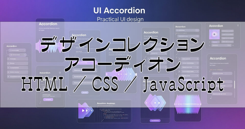
アコーディオンUIのデザインサンプル集です。
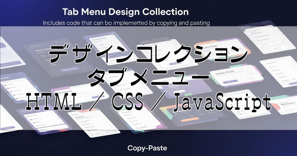
実装コード(HTML / CSS / JAVASCRIPT)は各詳細ページで確認・コピーできます。
各デザインは HTML・CSS・JSコードプレビューツール にて実装確認ができます。
アコーディオンUIとは?
アコーディオンUIは、見出しをクリックすることでコンテンツの表示・非表示を切り替えるインタラクティブなUI要素です。
FAQページやサイドバー、長いコンテンツの整理に活用でき、限られたスペースで効率的に情報を提供できます。
01 シンプル|Simple
- Simple and user-friendly design
- Basic open/close animation
- Responsive design
02 カード型|Card Style
- Card-like appearance
- Shadow effects for depth
- Modern design
03 グラデーション|Gradient
- Beautiful gradient background
- Colorful and attractive
- Visually impactful design
04 ボーダー|Border
- Utilizes border lines
- Minimal and refined design
- Professional business design
05 アイコン|Icon
- Plus/minus icon included
- Icon rotation animation
- Usability-focused design
06 ネオン|Neon Style
- Neon light glowing effects
- Cyberpunk atmosphere
- Perfect for dark themes
07 グラスモーフィズム|Glassmorphism
- Glass effect background
- Blur effects for modern look
- Latest design trend
08 3次元|3D
- 3D dimensional design
- Depth effect with perspective
- Modern and premium design
09 レトロゲーム|Retro Gaming
- Classic CRT monitor style
- Green neon glow effects
- Retro gaming atmosphere
10 ミニマリスト|Minimalist
- Clean and minimal design
- Subtle animations
- Professional appearance
11 付箋風|Sticky Note Style
- Yellow sticky note appearance
- Natural paper texture
- Friendly and approachable
12 グレーアウト|Grayed Out
- Muted gray color scheme
- Subtle transparency effects
- Professional and calm
13 中央ライン|Single Line Centered
- Single line with centered text
- Minimal and clean appearance
- Perfect for minimal layouts
14 ボーダーレス|Borderless Simple
- Clean borderless design
- Simple plus/minus icon
- No visual clutter
15 上下ボーダー|Top Bottom Border
- Simple design with top and bottom borders
- Clear visual separation
- Plus/minus icon on the right
16 ホログラム|Holographic
- Rainbow holographic effects
- Iridescent color shifts
- Eye-catching design
17 FAQ|FAQ
- A: This is a simple Q&A style accordion with clean Material Design principles.
18 ネイチャー|Nature
- Natural wood grain texture
- Organic color palette
- Warm and charming design
19 シンプルグレー|Simple Gray
- Grayed out simple design
- Clean and minimal appearance
- Subtle hover effects
20 シンプルボックス|Simple Box
- Simple box with thin borders
- Dotted line separator
- Minimal design approach
21 吹き出し|Speech Bubble
- Speech bubble design
- Light blue color scheme
- Friendly and approachable
22 カスケード|Simple Cascade
- Simple cascade animation from top
- Items appear sequentially
- Smooth cascade effect
23 左カスケード|Simple Cascade Left
- Left to right slide cascade
- Items slide in from left
- Dynamic slide effect
24 右カスケード|Simple Cascade Right
- Right to left slide cascade
- Items slide in from right
- Dynamic slide effect
25 左線アクセント|Left Border Accent
- Clean and modern minimal design
- Focus on typography and whitespace
- Left border indicates active state
26 ドットマーカー|Dot Marker
- Minimal styling with dot indicators
- Subtle interactions
- Clean layout for text content
27 ソフトダブルボーダー|Soft Double Border
- Rounded corners for a friendly look
- Subtle shadow creates depth
- Independent styling for each item
28 サイバーパンク|Cyberpunk
- Neon and Glitch Aesthetic
- Clip-path Angled Cuts
- Cyberpunk UI Elements
29 ニューモフィズム|Neumorphism
- Soft UI with Light & Shadow
- Elegant Button Integration
- Tactile & Realistic Feel
30 オーロラリキッド|Aurora Liquid
- Animated Gradient Background
- Fluid and Liquid Motion
- Beautiful Color Transitions
31 ターミナル|Terminal
- Dark Theme with Code Aesthetic
- Monospace Font & Prompt Style
- Syntax-Inspired Color Scheme
32 ステッパー|Stepper
- Clear Step-by-Step Flow
- Numbered Badge on the Left
- Clean Process Visualization
33 パステルカード|Pastel Card
- Soft Pastel Color Palette
- Smooth Rounded Design
- Light & Airy Feel
本サイトで公開しているUIデザイン一覧
当サイトで公開しているWebデザインやUIの実装例は、一覧として以下記事に纏めています。
あわせて読みたい

Webデザイン・UIコンポーネント集(HTML/CSS/JS)
HTML / CSS / JAVASCRIPT · 随時更新中 WebデザインとUI実装例集 Webサイトやアプリで使われるUIコンポーネント・デザインパターンをまとめました。それぞれのカ...